Simple, intuitive and on brand system to monitor brand health of the V&A Brand in the UK and selected international markets. Goal is to provide them with key insights to evaluate and inform how V&A engage with their audiences in all channels, explore it and use it to build better connections.

Role Client Date
UI/UX design V&A 2019
Data integration
Development
The challenge

V&A were experiencing challenges around navigating through their various markets to drive in-depth insights and actionable results from their current platform, which hosts similar respondent level data. The UI tool needs to be a cross communication tool – they should be able to easily share metrics, interact with different markets and be strongly branded to reflect their identity.

How might we empower V&A to extract the right data to help them to better engage and explore their audiences across multiple markets?
How might we marry the bold brand guidelines and visualization of metrics together?
Design process

Working with the rest of the team and the clients we gathered requirements; functional and non-functional, investigated the design system, respondent level data, and technical limitations as this is vital to set the right expectations very early on. Gathering requirements helped plan out the scope and roadmap of the project – determine key milestones, deliverable dates and sketching and creating the site map.

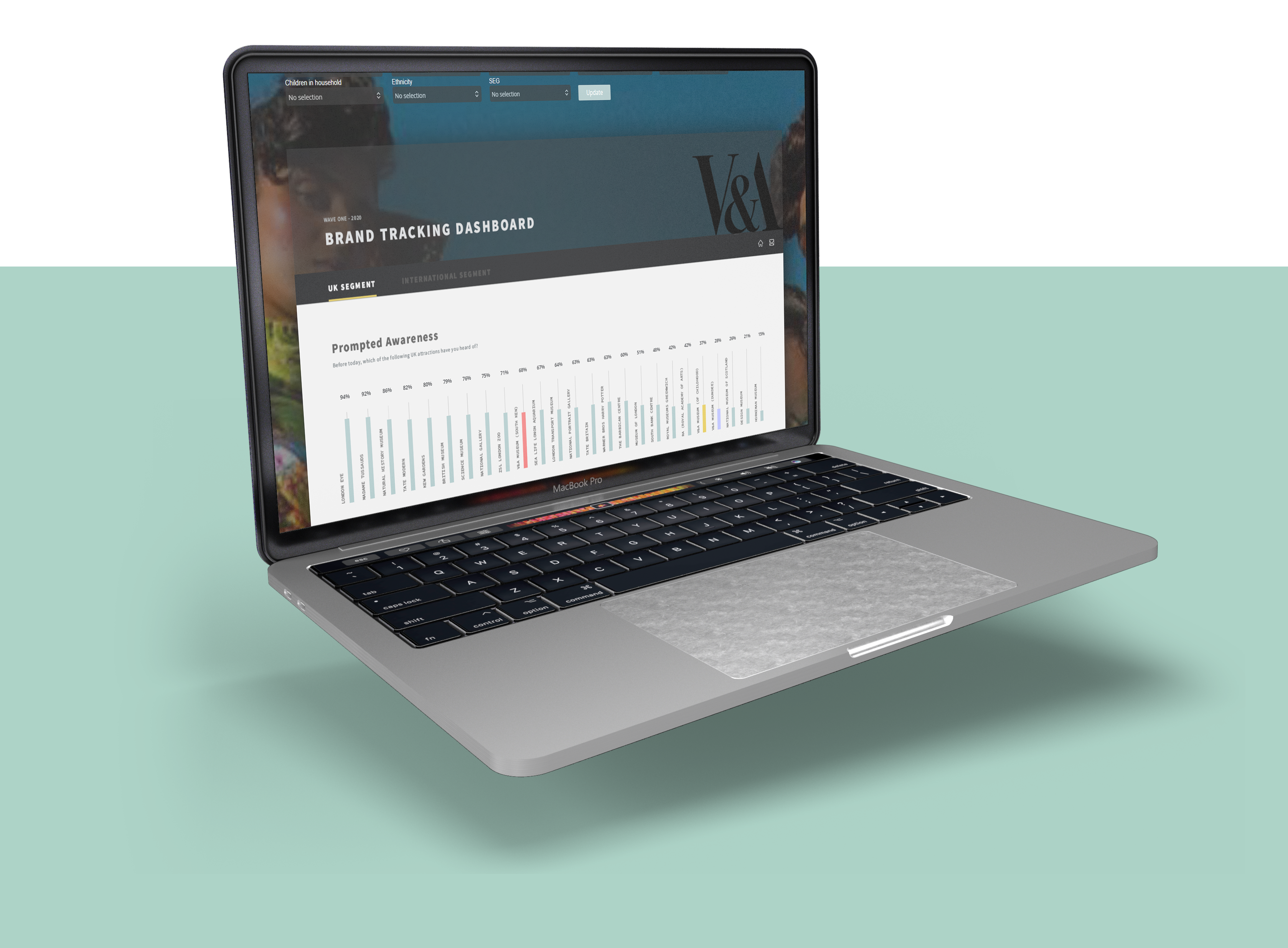
As the data that will be included in the dashboard is a key aspect, I liaised with the data processing team as well as the clients during this phase, repeatedly to keep both aspects – UI features and data working simultaneously. It was predominantly important to display the correct type of charts for each metric, as this plays a paramount effect on the readability and understanding of data. Ultimately success in this helps to validate the main goal of this UI – being able to gain insights to improve communication with stakeholders, customers and business model.

I wireframed iteratively to define the data metrics architecture of the different pages. And looked into different navigation approaches to conclude the best user experience, particularly since there will be separate screens for the UK segment and international segment. I collaborated with the V&A team to validate concepts and gather feedback to improve the experience, iteratively.

Upon the approval of the wireframing, prototype began and this visually got the team excited as they could experience the site mapping and the way the data will be displayed. This helped to identify pain points, such as displaying in a different form, including a mail button at the top to easily communicate the product with stakeholders. This also aided in a better development experience on my side, as major changes that would affect the time-scope was not faced as these were ironed out at the prototyping stage.

Finally, I developed, integrated the data and hosted the product on our CRM – Dapresy.

UI considerations

The overriding style of the UI is dark, this in line with their established brand. Moreover, their brand guidelines used pastel colors as secondary colours, and visually this pops better on a contrasted background. And their font choice is bold, which paired well with all of these elements. Good balance?

I’ve used a single full-page grid system to design this UI. The main reasoning behind this went down to enable the future use of this UI and its functionality. The client’s main requirement involved, always displaying 25 brands per widget, across all pages. This means using multiple widgets on a page would not allow for hierarchy in design, nor give balance and importance to the key metrics the page. V&A’s users are also used to a scrolling interface, I know this from the user research I conducted and also their website is heavily scrolling and user feedback from this is positive. I knew going ahead with a largely scrolling UI will not affect the user experience in this instance.

In terms of visual hierarchy, I’ve given prominence to chart titles, as this in the very few seconds of viewing the UI indicates which chart the user is looking at. The user does not need to search for this vital information. I’ve also set four main colours for the charts, three of which always stay consistent to the brand the colour represents. From my research, and upon client requirements, these 3 brands are part of the client’s group and they measure KPI’s against them, so it’s important to visually see this consistently across all pages.

Testing

I tested the UI by looking back at my user persona and identifying goals set here. These test cases were then replicated by individual potential users to see whether they were able to efficiently and easily be able to action each goal. As the users were able to complete this, it also gave me a better understanding on how successful the visual design is.

Next, I targeted specific UI elements, such as the buttons/links being accessible, filtering and searching working, images are displayed correctly, and the page navigation is used effectively.

Finally, I tested the performance of the web page, this was something I was quite keen to check on different devices because the user interface is multimedia heavy with many high-quality resolution images and functionality that calls back JavaScript, such as the ‘mail-to’ buttons. It was important that there was a level of consistency in performance with these elements across different screen resolutions.

Conclusion

The user interface provided the V&A team ease of navigation through their various international markets to gain insight and actionable results from the study they run on a wave-by-wave basis. Upon reflection, I would enhance my approach by understanding in more depth the data limitations at an earlier stage. This was greatly emphasised during the final stages of the design process, whereby the client wanted to make a data related change, that would impact the design and functionalities on a high-level. This meant more time and resources was spent in accommodating and finding a solution to this request.