Functional, interactive, and robust insight portal. Holds key data from BT’s Enterprise Tracker securely. This insightful tool, focuses on trended data for all brand-related and product-related KPIs, allows for comparability of key brands performance over time and view key Enterprise reports.

Role Client Date
UI/UX design BT 2021
Data integration
Development
The challenge

The team relied on hefty Excel and PowerPoint presentations for transforming and sharing data. This process was ineffective as it took up a lot of time for the internal team to produce and maintain for their stakeholders. It was lacking in user ability and valuable resources were being used. The internal BT team already gather respondent level data, but with the reporting they have to manually analyse the data and data checking, with their current method of data visualization.

How might we display multiple years’ worth of aggregated data in an interactive, user friendly and informative way, all in one place?
How might we make the portal a centralised location for viewing product and brand KPI insights and securely storing documentation?
Design process

I plotted out a possible design process, broken into different cycles and some being iterative. This helped to plan out and work towards a tight deliverable date given by the client.

I created site maps, wireframes and user flows for this product, all of which helped to get the experience right for the user and work out where to place the information architecture of the application.

The user flow allowed me to understand a user’s tasks and goals, then I created the site map to understand the relationships between the different user types and the use of the user interface. This guided the creation of the low fidelity wireframe to understand screen to screen interactions and where best to place visualisations and charts to meet such goals of the user.

I enhanced on the existing design system provided by the client to adapt and expand on to cater to the wide spread use of UI components across the portal.

UI considerations

I used a unified multi slide grid system to create cohesiveness across the multiple pages of metrics and maximise use of space. Offering plenty of room for data, even when it gets wide – which I knew would happen from the goals identified at the start of the design process.
Also, from the wireframing which gave an idea of information and layout that needs to be displayed in the product, I was able to look at the placement of content. From my observation users were reading the content in a ‘F’ movement, this means they tend to read horizontally across the upper part, move down the page, read a little, and then reads the rest in a vertical movement looking for key information. This pointed me towards including navigation elements at the top and using font size and colours to highlight hierarchy and for the user’s eye to easily find key information.

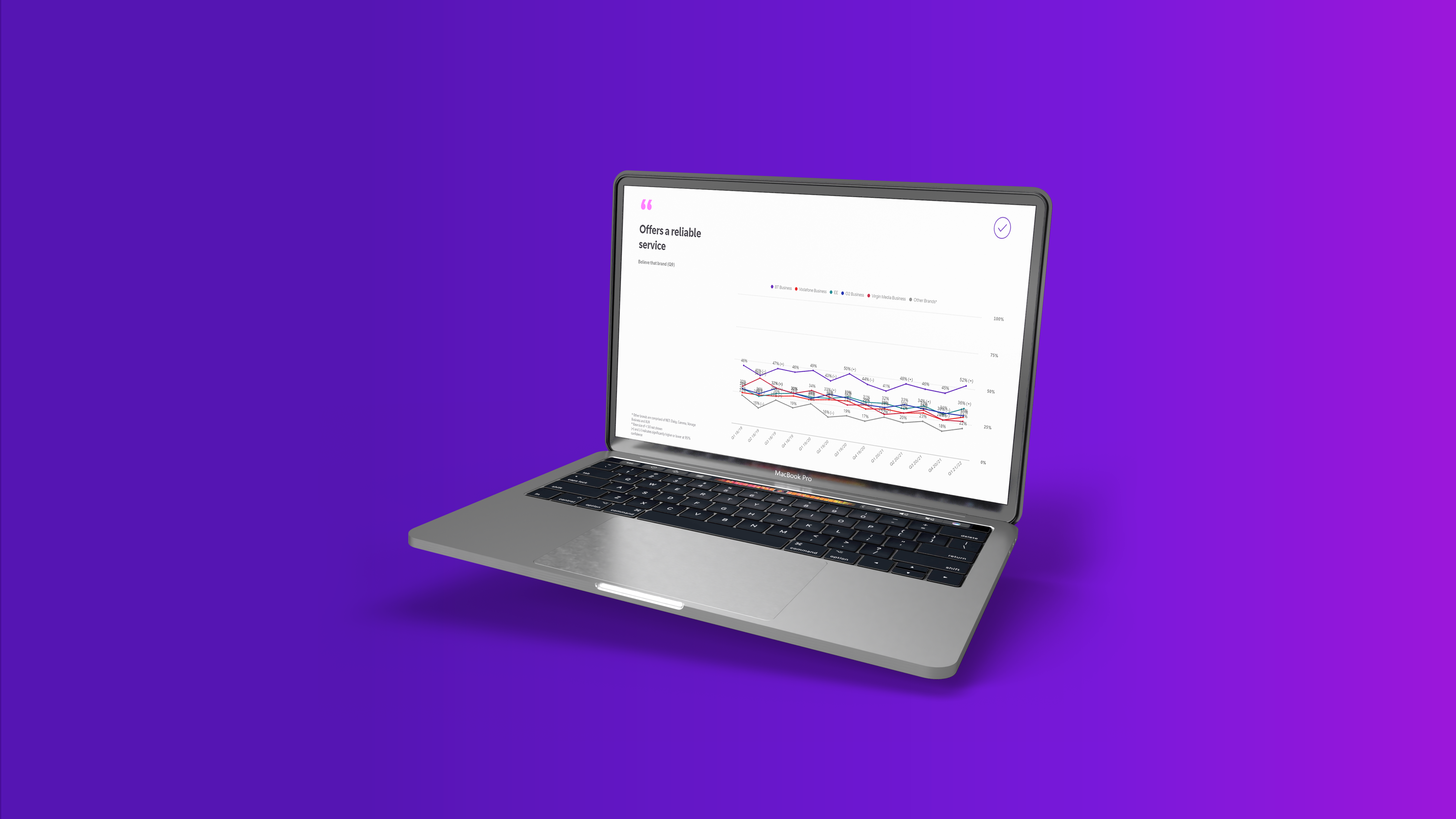
I’ve used icons across each widget to engage the user by providing hierarchy and give them an indication of what that chart represents before they have even read the title. This also helps to break the mono trended charts and text that is heavily presented in the product, due to the nature of the UI.
Following on with the theme of visual hierarchy, the buttons I used in this interface, included microcopy – which tells the user exactly what a button would do upon action. E.g. ‘Scroll down’ at the top right hand corner of the tab is used to enhance user experience as the pages are quite long, and the microcopy of the button states exactly what will help when that button is clicked on.
I also added a progress banner for ‘Product imagery’ page, as there are five products that they can explore within the master slide. As this is on the same page and just above the chart, it becomes more accessible and easier for the user to find.

The overall style of buttons are long rectangles, with curved edges. This was intentional to reflect human knowledge of buttons and onclick events, as many UI elements already display these styles as a functionable button, therefore I wanted to retain some familiarity. Avoiding cognitive overload.
And the colour palette used in the user interface is within the established brand guidelines, as this will be a cross platform to analyse data, host and upload various business-related information. I wanted to integrate this system with the rest of their products.

Testing

I had a wider team to do the user testing on this project, which was helpful since different perspectives allowed to cater for the different types of stakeholders that would potentially use this interface. We were able to identify pain points to improve on and come up with a solution for around the efficiency and ease of learning. Regarding efficiency, some users felt they did not want a project selection page, while others felt a project selection was essential as the application had many sections to explore – within the parent container you had four child sections, then another parent’s container within it two child sections. After gathering further feedback and monitoring engagement and error tolerance, we decided to preserve the project selection page as it gave pattern to the navigation which ultimately made better sense, since only certain stakeholders are interested in particular sections.

It was also important to test ease of learning on how to navigate and use the features/functions included in the UI, as they play a crucial part in the goal of the interface. The findings from this were, generally new users and re-occurring visitors were able to use the interface with much ease, however, this was better improved by including further instructions on the top hero image page, and chart related instructions on the bottom left of each widget.

In terms of testing the visual indicators, we looked at the main elements from the icons, colors, fonts, types of mediums used and buttons to the layout a hierarchy of information. This was unanimously positive, and the only pain point mentioned was to watch out for the font readability on the top menu in ‘Product KPIs’. As the inactivate state button could be more visible to the user.

Conclusion

The dashboard has had a positive impact on the internal and external BT team’s productivity and data analysis. They have been using the report tab to upload external reports, in which users can view at a centralised hub, rather than these documents being emailed out individually. The brand and product KPIs displayed is being utilized to make important business decisions and the BT team continue to add custom development to the UI to enhance their user stories and initial requirements.

My creation of a design system when initially setting up this UI has really impacted positively, as the time it takes for pre-development approvals and development times of the functions on the web interface has drastically improved.