Detailed, beautiful and engaging dashboard to understand audience sentiment on returning to the cinema following the Covid-19 coronavirus pandemic.
| Role | Client | Date |
|---|---|---|
| UI/UX design | BFI | 2020 |
| Data integration | ||
| Development |
BFI did not have a clear way of displaying and understanding their findings surrounding audience sentiment on returning to the cinema following the Covid-19 coronavirus pandemic. They also did not know how to manage and display metrics as their study grew, this means the UI needs to be adaptable to growing UI elements and robust.
Utilising the high-level understanding of the project’s requirements, we were able to gauge the complexity of the data file, the number of charts that need to be included and the digital pages needed to compose this project. For this reason, myself and my team broke the project into four key phases. This allowed each member to communicate ideas and requirements effectively and identify high-level charting metrics to use, in turn allowed us to validate potential solutions early and often.
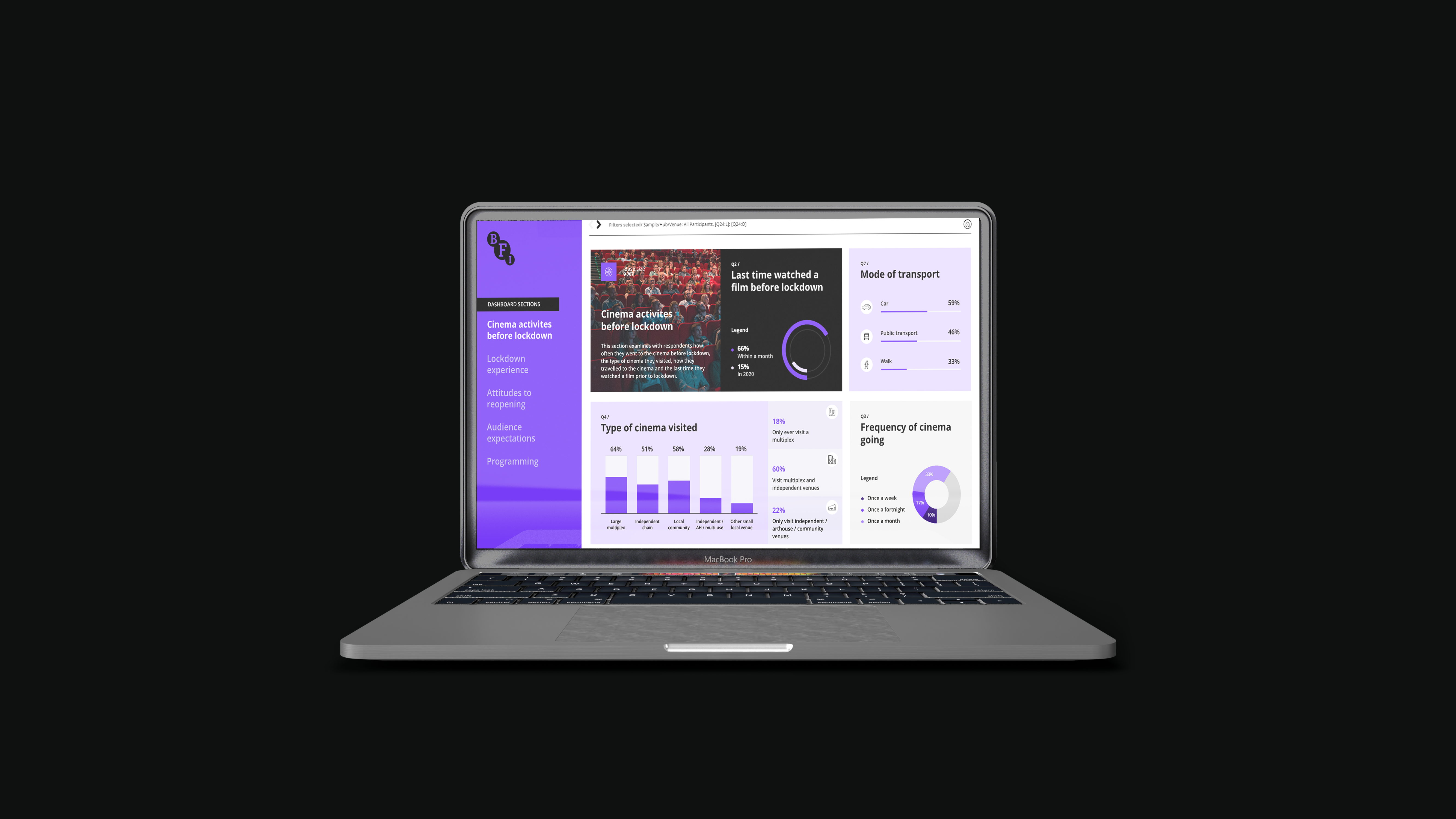
To increase usability, I placed important functions at the top of the page, such as showing the type of ‘Sample’ selected, as this is a key function that the user needs. As this dashboard will be used by BFI and its participating Hub members, and it is vital for this transition to be smooth and easy to achieve – so that Hub members can filter between the different samples, depending on which set of data they want to view.
Moreover, I have placed the dashboard sections page in bold BFI branding on the left-hand side of the dashboard, as this is a natural flow users expect when navigating a BFI product and it is in proximity with other navigation elements on the web page.
I have also carefully considered the layout in terms of placement of widgets and charts on the dashboard, they have been strategically placed to provide high level information at a glance, and on hover, allow for the option to view further detailed information on charts.
Visual hierarchy was important for this interface due to the quantity of textual content that was needed to be included – playing with font sizes, placement and colours allowed for prominence where necessary. And including icons for visual cues, also helps to break down text, which means the user has to probe through less text and can relay back to their visual memory, ensuring their focus is on key elements instead.
Accessibility was another consideration to ensure colour palette works across the product. I also used Adobe accessibility feature to validate these against the right colour and font size, so the product is legible for the various users. Another instance of colour theory is
Another instance of colour hierarchy is used in the side navigation, which shows which section is currently active and which are not, and animation (hover) is used to indicate the sections which are available to be explored.
The overall style of this UI is dark, and this was done intentionally to reflect the mood of being in the cinema – I was focusing on creating an experience. This was supported with the use of cinematic imagery for the hero section, which was contrasted with a gradient dark overlay to allow for better legibility on the text content. This immersive experience would help users to indulge themselves in the data and find key findings that would support their particular sample.
BFI continue to import new data and use the web UI to gather insights and support KPI information.
Upon deployment, a different approach could be used to detail errors.
Although users were able to navigate back to the home page to look at error notifications as to why a particular data set was not showing up due to their filter selections, they continued to struggle with this. This is something that was picked up at a later stage, and not during the GUI testing, as new data was added and there were differences in metric values. I would strengthen this to add better visual cues, by adding a ‘no data due to filter section [x], base too low’ notice when this occurs on the page the user is on, so they do not have to travel elsewhere on the webpage to find this warning. This version would be stronger because it improves usability and the users flow is not interrupted.